

If you’ve ever tried to get to grips with responsive web design, you’ll know firsthand that it can be frustrating. Making sure your site looks great on just about every device is a daunting task. What’s more, being uncertain about how your site’s design will appear on a particular device could end up with bounced visitors. CSS media queries are a simple way to help create a responsive website.
SimpleCSS is an online tool that generates media queries for you based on your breakpoint or platform, and in this post we’ll show you how you can generate them in three clicks. To round up, we’ll also show you how Divi implements media queries out of the box.
An Introduction to CSS Media Queries
CSS media queries are a cornerstone technology of responsive web design. The CSS @media tag is used to set style rules based on different media types and devices. In simple English, media queries evaluate the capability of the device that is accessing your web page, and checks for its properties. These generally include:
- The width and height of the viewport.
- The resolution of the device.
- The orientation of the device.
Responsive web design focuses on adapting your site to be used on different devices. For instance, there’s a significant difference in user experience between a visitor using a mouse to navigate through your site, versus a touchscreen. Media queries enable web developers to bridge the gap in their site’s design:
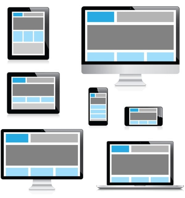
Image by MPFphotography / shutterstock.com.
Rewriting your site’s code to cater to each of the hundreds of devices that access your website simply isn’t feasible. Media queries work by using the same underlying HTML code, adjusting to the device’s screen size and orientation dynamically based on simple rules.
CSS3 enables web developers to define styles based on the device’s page width. Since the device’s page width correlates with its size, developers can essentially define different layouts for devices of various screen sizes by simply adding conditional rules in media queries. Some of the most commonly used expressions used for writing conditional rules are min-width, max-width, and orientation.
In a nutshell, media queries basically find out how big the device’s screen is, then apply some specific CSS to that screen size.
Benefits of Using Media Queries
The key benefit of using media queries is that your website is easily viewable by everyone, regardless of the device they’re using. From a technical perspective, media queries are compatible with all major browsers, and could potentially help your site rank better in search engine results. Some additional benefits of using media queries are:
- A potential improvement of performance on mobile devices.
- They enable you to create a mobile-first responsive design.
- They provide a potentially better user experience to visitors.
- The ability to display device-optimized versions of your site.
Media queries should ideally be used every time you need to make a particular page element responsive. For instance, if your site is split into a three-column design, chances are it’s not going be readable on a smaller screen such as a smartphone. Media queries enable you to change the layout to a one-column design for smaller screens.
Introducing the SimpleCSS Tool
Of course, creating all of these media queries can quickly become a pain. SimpleCSS is an incredibly useful tool for generating them, helps to take all of the heavy lifting out of targeting specific devices, and negates messing around with conditional expressions. Let’s take a look!
SimpleCSS
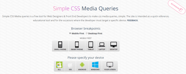
As the name suggests, SimpleCSS is an easy-to-use tool that enables web designers and front end developers to generate media queries for specific devices. Once you select a device, the tool outputs a media query tailored to that particular device, which can then be pasted into your CSS files. SimpleCSS also generates media queries based on breakpoints.
Key Features:
- Enables you to start from two different approaches – mobile-first and desktop-first.
- Enables you to select a general device to generate queries for.
- Offers media queries for 286 different devices.
Price: Free | More Information
How to Generate Media Queries Using SimpleCSS (in 3 Clicks)
Now we’ve looked at what media queries are, and the tool that makes creating them simple, let’s show you how to generate media queries in only three clicks!
Step #1: Select Your Approach
The first step in choosing your media query is to decide on an approach for your responsive design, and you’ll need to select from Mobile First or Desktop First:
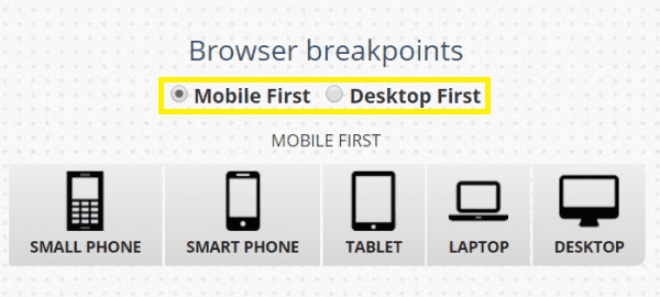
If you’re struggling to choose, here’s the skinny on what both mean:
- Mobile First: This approach puts the focus on mobile devices, enabling you to optimize your display for those first, before larger-screened devices.
- Desktop First: This approach is designed to make your site look good on larger-sized screens at the expense of smaller ones.
Next, you’ll need to choose a device type.
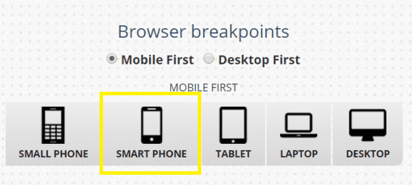
Step #2: Specify the Device Type
Once you’ve selected your approach, the next step is to pick from one of five different breakpoints – Small Phone, Smart Phone, Tablet, Laptop, and Desktop. This is simply the points at which your site’s changes to provide an optimal layout for the reader’s device:
This step is simple – just click whichever device you’d like to generate media queries for!
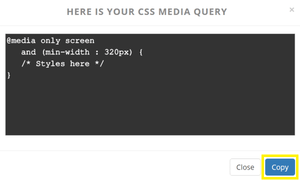
Step #3: Copy the Media Query
Once you’ve selected a device, a modal pop-up will appear containing your media query. From here, simply copy the code and paste it into the appropriate place in your CSS file:
How to Generate Media Queries For a Specific Device Using SimpleCSS
Generating general media queries is fine as a general approach, but what if you need to generate them for a specific device? Let’s show you how to do it – again in three clicks!
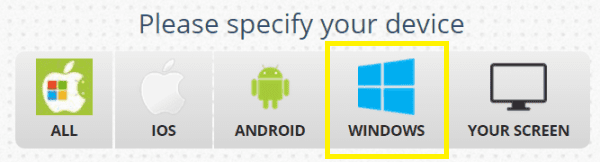
Step #1: Specify Your Device’s Operating System
Firstly, select the operating system of the device you’d like to generate media queries for. SimpleCSS supports iOS, Android, and Windows. As a bonus, you can also generate media queries for the screen you’re currently using!
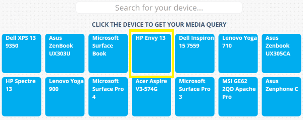
Step #2: Select Your Device
Once you’ve selected your operating system, you’ll need to filter down the device options available. There are 286 different devices supported in SimpleCSS, and if the selections are a little overwhelming (especially for Android devices), you can use the search bar to narrow the choices down:
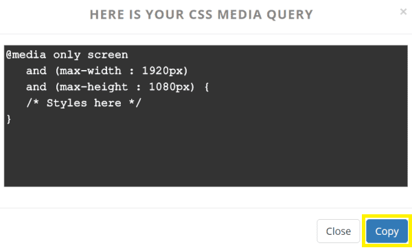
Step #3: Copy the Media Query
Once you click on the relevant device, you’ll once again be presented with a modal pop-up containing your generated media query, ready to be copied into your clipboard:
That’s all there is to it! You’ll never again have to manually create media queries, and your sites can be one step closer to becoming responsive.
Responsive Design and Divi
Our Divi theme already implements a responsive design based on media queries, meaning you may not need to generate them yourself. Check out this example to see what happens when you resize your browser’s window:
The theme adapts dynamically to the changing window size – which is the premise behind using media queries. As the width of your browser window decreases, the layout changes ensuring that the content is still easy to read. The three different breakpoints take action, and give Divi’s layout a fluid-like feel. At different breakpoints, the media query that is triggered takes effect, and the layout of the design changes accordingly.
Conclusion
If your website isn’t responsive, it will likely suffer in search engine rankings. One way to ensure your site remains responsive is by using media queries. While they may have been difficult to create in the past, generating them is quick and simple with a tool such as SimpleCSS.
Let’s recap how you can generate media queries in three clicks:
- Select your approach and device, or your desired operating system.
- Specify the appropriate device type.
- Copy the generated media query, and paste it into your CSS file.
Do you have any questions about generating media queries for specific devices? Get in touch via the comments section below, and don’t forget to subscribe to follow the conversation!
Article thumbnail image by Ira Yapanda / shutterstock.com.


What a really useful and great piece of advice for responsive designs. Thank you!
Hi ET-Team,
Good article, thanks. A couple of remarks. Within the divi builder you can choose appearance between 3 devices/sizes > Smartphone, Tablet, Desktop
#1 Which breakpoints do you use per device #2 breakpoints for tablet landscape and desktop are the same in the divi builder – but should be different because screen sizes are quite different between those to starting at 1024pixel (tablet landscape) and actually never end 🙂 on huge desktop (1920+pixel). It would be good to have Smartphone, Tablet Portrait, Tablet Landscape and Desktop.
What do you think?
Hi Stefan,
Thanks for the feature request! Sounds reasonable (and useful!) to me. We’ve made a note.
Best,
Nathan
Divi does a great job with media queries already. But it seems one of their most recent updates enabled a media query which removed all the images on my home page slider. I have the option “show images on mobile” checked and I even tried to write code to get around it, to no avail. Any suggestions? Or am I bound waiting for Divi to fix this glitch?
Hello Jenna,
That sounds like a problem for our support team. 🙂 Drop us an email from this page (https://www.elegantthemes.com/contact/) and we’ll take a look!
You are always on point giving great and helpful tips.. thanks
Thanks. 😀
Exactly, Divi already has this!
thanks for sharing the tool.
Ismail
Thanks, Ismail!
Hey I made this tool 😀
Thanks so much John for that article!
http://simplecss.eu
No problem, Michael – it’s a great tool. 😀
Wow!
Great learning point, just discovered this blog and fall in love with content published here.
Thanks, will visit again 😉
Welcome to the club, Umer. 🙂 Glad to have you onboard!
Thanks for the resource John!
@Flash Alexander, there is more then media queries there…
Thanks, Theo!
I think it is over kill. Easy enough to have a list of commonly used media queries as a macro in notepad++, or code in OneNote 🙂 Nonetheless, interesting to note.
There are plenty of ways to keep hold of important pieces of code – this way offers a nice layout, with a constantly updated list of devices. We say: use whatever works for you!
WOW!!! thanks John, I’m always struggling to determine at what widths breakpoints should occur and this “simple” tool make that real simple!
No problem, Hurri. 🙂
Would be nice to see how custom media queries are added to divi to extend it beyond the 3 default. I’m assuming you just add the breakpoints and CSS to the “custom css” section of divi theme options?
I typically resize the browser windo and make my change in the browser using Chrome Inspector and then grab the css that I altered then paste that into the CSS file but didn’t know if there was a better way using Divi builder?
It sounds like you have a decent way of setting breakpoints, Kenny. You could always post a question in our forums (https://www.elegantthemes.com/forum/) to see if other users have a different method.
Thanks for your comment. 🙂
Thank you for the heads up on this tool. Although I rarely need to add media queries to sites that use the Divi theme, I still have to use a few to make my sites look the way I want them to look. This tool makes it a little easier to generate the queries, which is always a good thing.
Np problem, James. Glad you enjoyed it!
Good resource. I have to do this specifically for the Samsung Galaxy Tab 10.1 b’c the native browser has a high ppi. Notorious trouble with Samsung’s native browser when sizing a logo at different breakpoints. 🙂
As a side note, to deal with the Samsung issue I mention, I have to use device orientation in the media query. That doesn’t appear to be referenced in the media query the link generates. That’s important b’c the high ppi output for the Samsung 10.1 falls into the larger desktop screen range. Without referencing the device’s orientation in the query you will get assets served very large.
Great tip, Leslie – thanks. 🙂